
Trying a new thing for the blog with a template change, since many had complained about the dark background and similarly dark text on it.
Along with the change I am trying this 'new' background image.
I will upload it here and see if all works!
An exposition of the Hobby of TableTop gaming.
With commentary, notes and other items connected to this hobby.


.JPG)


3 comments:
Nice layout Murdock. I was told a long time ago that if you are doing a presentation and printing out handouts that they should be dark text on a light background, if you're doing the presentation via a projector (powerpoint or similar) then make it light text on a dark background. But for viewing on a computer dark on light is better.
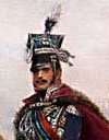
You'll have to forgive me though - I'm not familiar with that print. Which battle is depicted?
I like the new look. Noticed it right away.
Also, since I'm suffering from a nasty bout of something myself right now, I'm glad to hear to hear that there is "no more rampaging sickness" in your house.
As for the new look, I particularly like the gentle fade of color to white from the top down. The look of your battle photo goes very well with this new layout.
Good choice.
-- Jeff
Thank you gentlemen.
The print is of the battle of Libino from the early stages of the 1812 campaign.
I 'adjusted' it for use on the page by 'dodging' out the color, making the image 'greyer' so that the text could be read overtop of it better.
I have plans to change the images from time to time, maybe doing some of the miniature battles as well...
Post a Comment